Montezuma’s Chocolates takes on major rebranding across its ranges
UK confectionery brand Montezuma’s Chocolates has undergone a major packaging rebranding across its premium product portfolio.
The company approached design agency Butterfly Cannon, which has worked with a number of businesses within the food and drink sector, for the rebrand, amid challenging times for a retail sector heavily affected by the coronavirus pandemic.
With two decades in the confectionery sector, West Sussex-based Montezuma’s was born out of its founders, Helen and Simon’s love affair with Latin America and the extraordinary chocolate they found on their travels there, as Confectionery Production has previously featured.
Since setting up shop in Brighton to make their own handmade chocolates in a multitude of flavours, using only ethically sourced ingredients, their business had grown organically. With increased investment and an ambitious plan for growth beyond their own stores, they came to us to re-focus the brand’s purpose and re-think its creative platform and visual identity on pack to attract a more urban ethical consumer
As Butterly Cannon explained, through consumer research and working with the team at Montezuma’s our purpose became ‘inviting consumers to discover extraordinary chocolate flavours crafted with creativity and flair’ and our creative platform ‘Welcome to a World of Endless Discovery’; full of inviting exploration, hidden depths and wonderful surprises.
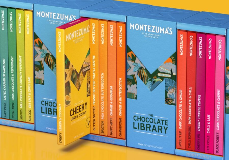
In terms of the design restyling, the design agency broke the Montezuma’s M out of the star that it sat in, boiling down and sharpening it in order to make it the instantly recognisable star of the show. More than just ‘M’ for Montezuma’s, the brand considers it ‘a portal through which to explore a fantastical world of flavours” with hand drawn illustrations alluding to the manner in which the chocolate is made.
Furthermore, the company added that its wordmark has been designed to reflect the sharp edges within the brand icon, while a six-pointed star in place of the apostrophe in Montezuma’s is a reassuring nod to the old brand identity. This visual link allows a flexible approach to the brand assets whilst maintaining a cohesive identity.
The central theme of discovery and variety is dramatically brought to life on pack through individual flavours having their own ‘M’ icon. Within each icon, the illustrations and colourways shift and change to tell the story of the flavour and bring to life quirky product names such as ‘Nutterscotch’, ‘Like No Udder’ and ‘Smooth Operator’. These are executed in a bespoke ‘Montezuma’s Sans’ typeface created to optimise legibility, whilst reflecting the hand drawn approach within the illustrations.
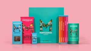
According to the firm, initial feedback to the new designs has been extremely positive, with comments from consumers via social media and has directly led to increased store listings, including more lines being added in John Lewis Partnership. Significantly, the company said that one of the key considerations for the move has been a consideration was to ensure its new packaging designs reflected the ethical and sustainable ethos behind the brand. The business has specified eco-friendly packaging across its entire range, which is believed to be a first a British brand in the premium segment.
In addition, the company swapped globally based suppliers for ones within Europe, with cartons created from FSC board with aqueous varnishes and glues, with no foiling and common finishes to avoid excess die creation. Inside, the bars have moved from a standard triplex plastic-based flow wrap material to being wrapped in fully recyclable EcoFlexi, a 100% paper based material. Our giftboxes now use ‘smart’ creative cutter guides to enable a glueless, folding box construction with a removable sleeve, to maximise recyclability. These and other measures, mean that 100% of the newly packaged range for Montezuma’s is now either recyclable, compostable or biodegradable. Even their old packaging has been repurposed by shredding it & using it to protect the contents of their gift boxes.
Commenting on the redesign, Debbie Epstein, marketing director for Montezuma’s, said: We’re absolutely delighted with the new brand identity and packaging that Butterfly Cannon have created for us. It has given the brand a new lease of life and the response has been incredibly positive from both the trade and consumers. The design is bright, bold and quirky, yet still premium, reflecting the brand perfectly.”
Topics
chocolate confectionery design packaging premium ranges rebranding sustainability
PeopleDebbie Epstein Helen Pattinson Simon Pattinson
OrganisationsRegions